View this video below or on the Erthos website: https://www.erthos.ca


The Brief:
The client required a compelling brand video that could both inspire brand engagement and explain detailed concepts to their audience. The goal was to bring awareness to the issues of single-use plastic manufacturing and demonstrate the viability of Erthos, as a better one-to-one product and solution. This video would be the first, in shaping the brand's impression and mission with its target audience..
My role:
As the Art Director & Designer, I worked directly with the erthos clients on all design feedback and in tandem with our copy writer and videographers for execution. I was in charge of first-concepts vis-à-vie the storyboard, the motion-graphic sequences, and the overall tone of the video. The story used both proprietary video footage and curated stock footage. I designed the entire animation sequence of motion-graphics for this video. As well provided custom editing of some existing erthos icons, as well as the design of net-new icons specifically for this video.
The Vision:
The vision for this video was to tackle a serious topic in an uplifting, impactful and solution-focused way. It was important that the audience feel compassion for the problem, but not feel shamed or accusation from the Erthos brand directly.
By starting with the positive benefits of plastic (innovation) the audience is first primed with good news so that they are in a more receptive mindset to hear about the consequences of single-use plastics. From there, outlining the global impacts and seriousness of these consequences, the audience is introduced to the Erthos brand as a simple, viable solution. This brand positioning was important to highlight and stress throughout the video because it alleviated the sense of hopelessness the audience might feel, and instead offered a positive outlook for the future of plastic manufacturing.

I setup the storyboard in a software called Milanote (which was easy to access and free for our clients to collaborate with us). Each scene was divided out by the main narrative portion and the corresponding video footage. This storyboard was flexible, and had version edits, direction, and notes inside each column for ease of organization and clarity.

Animation Sequence - Flow & Feedback:
The animated sequences were communicated via Zoom conferences to the videography team using still-frame images and boards, which outlined the main movement sections of each segment. Upon further refinement of the flow and working with the client's feedback, these sequences were adjusted into the format seen in the final video.
The challenge of communicating nuanced animation movement to a videography team over Zoom required 'interpreting' each frame with descriptions and directives. Then combining these movements with the exact timing of a pre-recorded dialogue. This required pinning the start or end of the motion sequences to a specific word or sentence in the narration script.
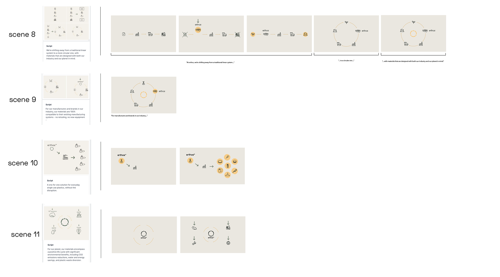
Images on the left of the line divide show the original brainstorm from the storyboard. Images on the right side of the line divide show the progressions of actual stop-motion steps. This board was a discussion over zoom with the videographers on how to translate these sequences into motion.
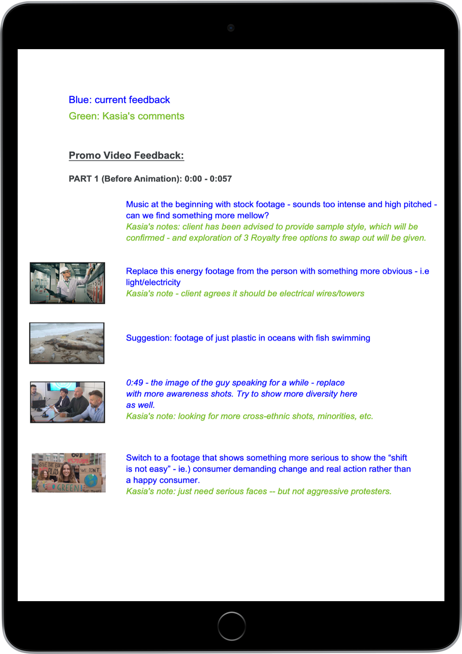
Translating Client Feedback:
As the go-between the client and the videography team, I was relied upon to take the client's feedback (both written and verbal) and relay this information to the fulfillment teams. An example of 'translating' this feedback (from the client in a hand-off to the videographer) is seen below. As with most clients, their ability to articulate what they feel is hinged on clarifying their vision with discussion and asking the right questions. In order to translate feedback into an actionable task, I needed to refine the client's ask and guide the videography team towards appropriate choices and delivery of the client's intended meaning.
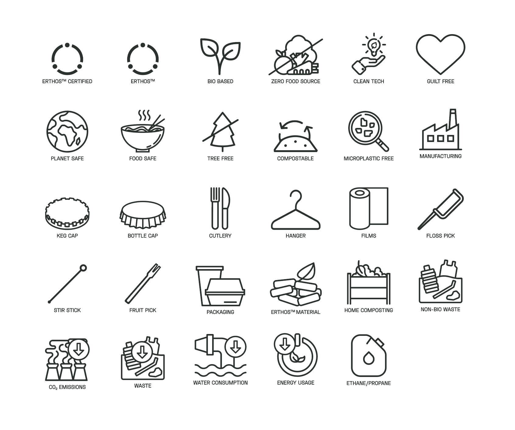
Custom Icon Design:
Another one of my contributions to this video, was the creation of custom-hand drawn icons to replace a series of icons that the client wished to improve upon and have designed specifically for this video.